Changelog: 2026 All-Star Break Updates
A few things shipped over the All-Star Break. Nothing flashy for its own sake, mostly the kind of midseason quality-of-life that makes team and player pages easier to read when you’re catching up between series.
Series Calendar
Team pages now have a Series Calendar: every series of the season in one list, with home/away, opponent logos, and game-by-game W/L color. It’s the schedule viewed the way baseball people talk about it: not day-by-day, but series-by-series.
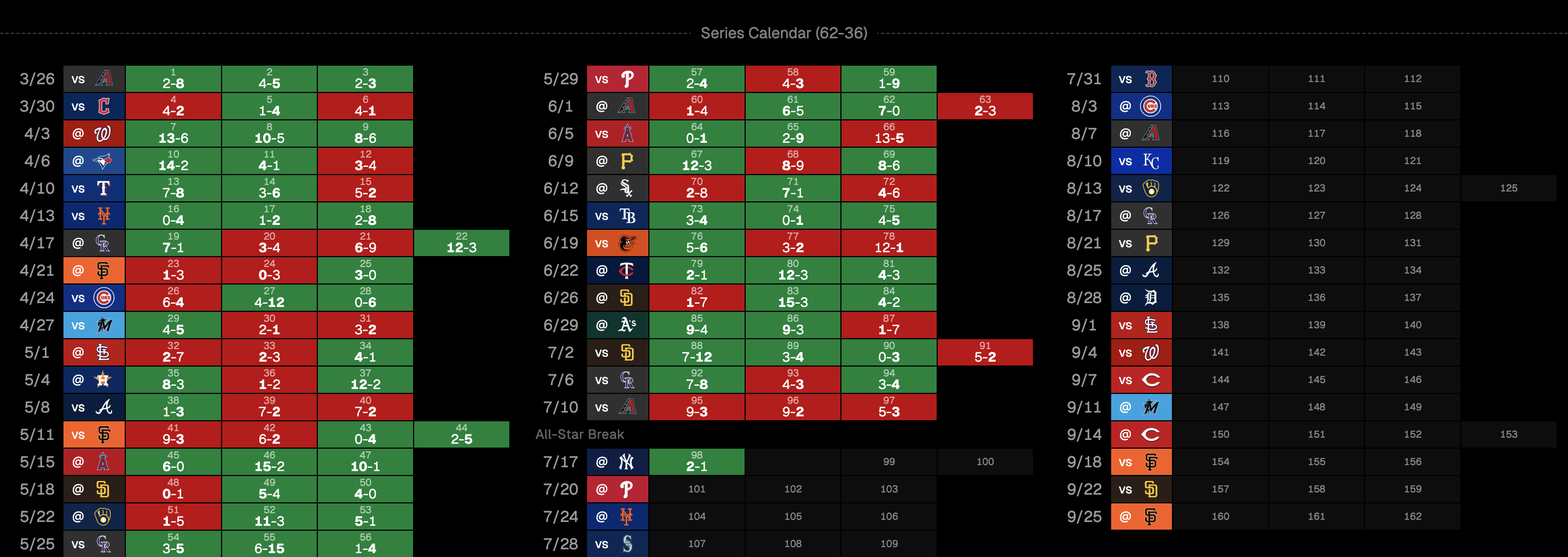
Try it on any team page, e.g. the Dodgers.
Season Splits
Player pages now show a season splits table above the year-by-year charts: per-season hitting or pitching lines, career totals, team logos, and a little positive/negative coloring so the outliers jump out.
If a player changed teams midseason, each stint gets its own row, with the most recent team on top.
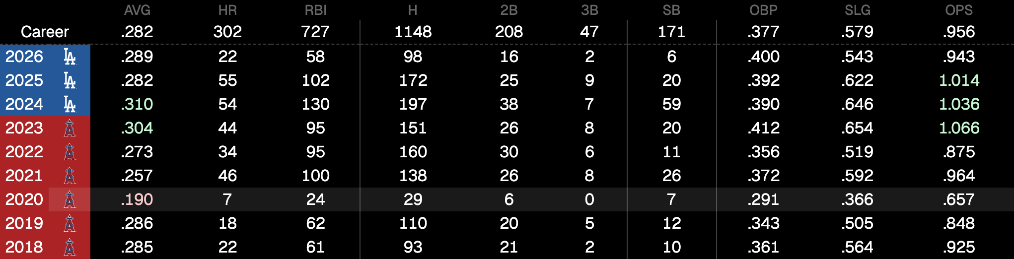
See it on any player page. Ohtani is a good example.
Year-by-year hover guides
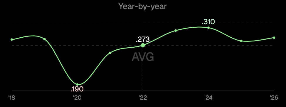
Hovering a year-by-year chart now draws dashed vertical and horizontal guides through the active point, with a neutral value label so you can read a season without guessing against the min/max callouts.
Hot/cold zones
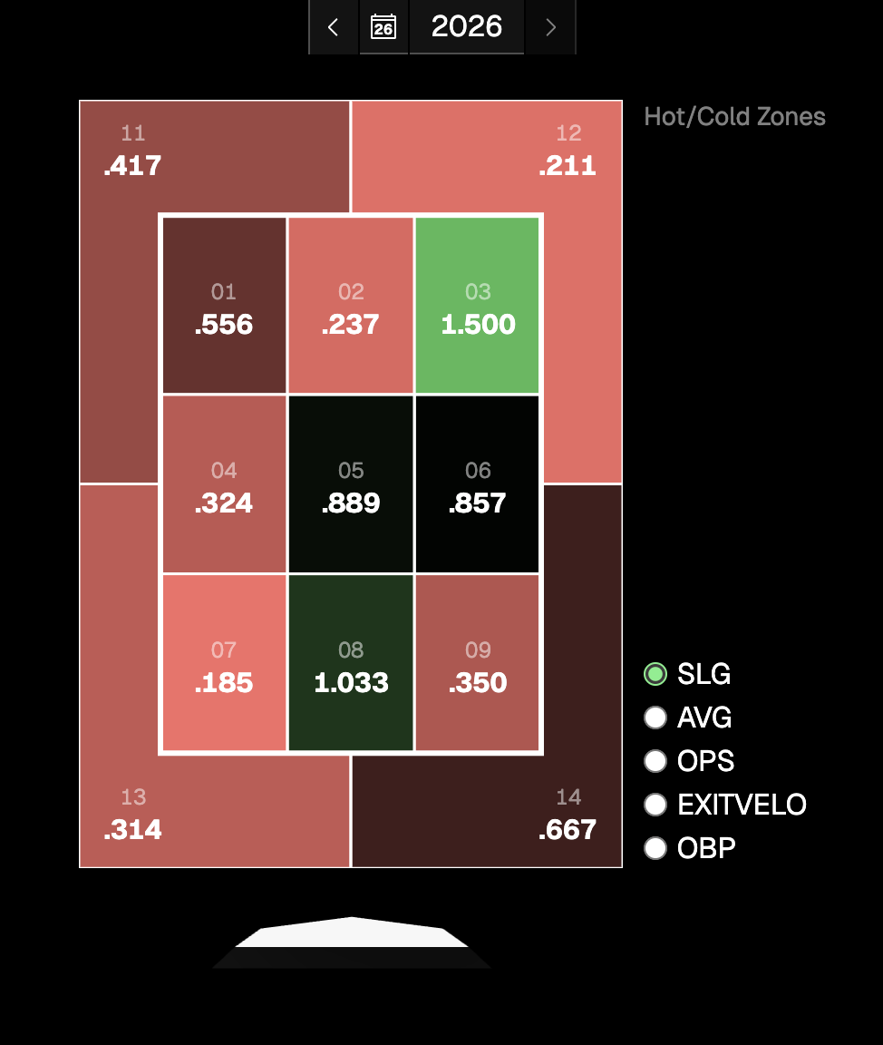
Hot/cold strike zones use a diverging scale now: green for hot, red for cold, transparent in the middle. Cold zones used to fade into the same green ramp, which made them harder to read at a glance.
That’s the break haul. Use the app, poke around, and tell me if something feels off or missing.